
Colour Trends For The Spring
Once the excitement of the holiday season is over, our thoughts often turn to spring planning to help us forget the cold of the winter months. We start dreaming of new fashions, new furnishings and décor accessories, and often it’s the colours of these items that figure prominently in our imagination.

So what colours should we be dreaming of for spring 2016? For that, let’s turn to Pantone, the world-renowned authority on colour.
The company holds meetings with international colour standards gurus twice a year to decide what colours will be de-rigeur next season. Its colour forecasts are followed faithfully by many designers.
For spring and summer 2016, Pantone’s top 10 choices are:
- Rose Quartz – Pantone 13-1520:soft, rosy pink colour
- Peach Echo – Pantone 16-1548:warm orange
- Serenity – Pantone 15-3919:an airy, transcendent blue
- Snorkel Blue – Pantone 19-4049:energetic, vibrant blue
- Buttercup – Pantone 12-0752:sunny, deep yellow
- Limpet Shell – Pantone 13-4810:light, fresh aquamarine
- Lilac Gray – Pantone 16-3905:light, warm gray, with a lilac tint
- Fiesta – Pantone 17-1564:light red with orange tint
- Iced Coffee – Pantone 15-1040:neutral, soft coffee-with-milk brown
- Green Flash – Pantone 15-0146:lush, bright, happy green
Trending decorating tips
For interior decorating colours — especially for walls, carpets and large pieces of furniture such as sofas — neutrals (whites; camel; tan; soft, warm gray) will be in vogue, but with stronger colour in accents: think an accent wall, cushions, an occasional upholstered chair, and various décor accessories.
For instance, consider white as the predominant colour with lilac gray and or rose quartz accents, or neutral beige as predominant colour with yellow and green colors decorating ideas.
According to interior designers Todd Nickey and Amy Kehoem, we will see, “A return to a more visible canvas of tailored and tonal fabrics and texture—think Andrée Putman and Ann Demeulemeester—in response to the more bright pattern and colors of the bohemian spirit of the last few years.” They went on to say that, “In 2016, we see ourselves pursuing this classic direction in our clients’ homes using tailored fabrics in textural neutral tones. The color camel seems to be driving this vision.”
What’s driving these colour trends?
As colours are strongly associated with emotion, the choice of a trending colour is a response to our collective emotion or state of mind (“zeitgeist”). For instance, our increasing interest in ecology and the environment is driving the popularity of green. This colour will feature prominently on everything from fabrics to accessories and countertops. Neutrals and blue hues are associated with peace and calmness, and in our current turbulent times we need to feel soothed and tranquil.
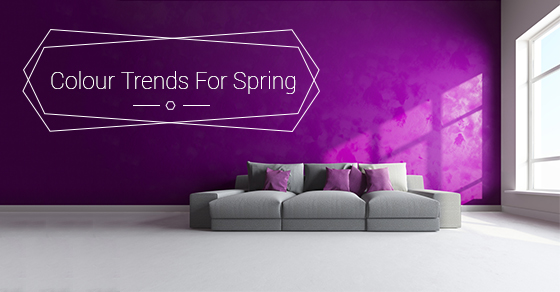
Goth trends in entertainment and literature have raised the colour violet into prominence, both on the fashion runway and in décor. You’ll likely see different variations of violet such as wine and true purple quite often. As pink and red are often chosen as the colours of popular and worthy causes (breast cancer, AIDS research, heart disease), these colours have steeped our consciousness. You might see red as accents in black-and-white designs, pink accents in romantic bedrooms, or a young woman’s living room or kitchen.
Which colours are fading?
If you are a chocolate brown aficionado, you’d probably be disappointed to hear that its popularity is waning. It’s transcending to lighter browns such as mocha and cinnamon. Light gray (from soft gray to charcoal to hematite) is replacing brown as the favorite. This gray works well with metallic and pearlescent accents, and the trend toward violet, wine and amethyst is replacing soft lavenders or true purples that came into vogue back in the 1980s.
Whether you’re looking to redo a room in your home or want to spruce up your entryway decor with a popular spring colour, talk to the Heritage Home Design experts today for tips, advice, and information.